A AngularJS directive that will help you display help blocks inline. Include ngAnimate for some extra sugar!
The post was written by Dan Mindru, the maker of Shipixen—the best Next.js boilerplate.
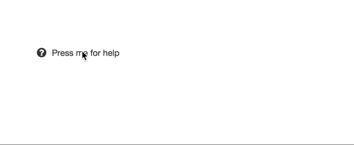
Hey there Angular girls & boys, today’s simple directive is gonna be for showing inline help blocks. If you are fond of ngAnimate than you’ll be able to enhance it the directive with it, here’s how the end result could look:
Grab it from github, see a quick demo here or add it as a dependency to your app using
bower install ng-help-block --save.
I’ve been away from Angular for a while, focusing on some Vue.js work for the moment. However, I thought that shouldn’t stop me from posting some helpful directives every now and then. By the way, if you are curious about Vue.js, check out this post about starting with Vue from an Angular background.
Motivation
Today’s web interfaces are full of distractions & interruptions. Help blocks can contribute to these distractions, especially when it comes to inline forms. A good way to maintain the current context yes to use inline-expandable blocks, which can work very well as an alternative to dialogs.
Building the directive
While planning out such a directive you must consider 3 things:
- template structure (layout)
- data that’s going to be passed to the directive
- user interactions (reactiveness)
Let’s start with the template. We’ll need a container with 2 blocks: one for the title & one for the content.
<section >
  <p  ng-bind="title">
</p>
  <p  ng-bind="content">
</p>
</section>
We can anticipate that there’s going to be a flag that shows/hides the content, therefore we can add it to the content paragraph. To later help with the styling, we can also add a ng-class attribute on the container.
<section  ng->
  <p  ng-bind="title">
</p>
  <p  ng-bind="content" ng-show="hbVisible">
</p>
</section>
The next step is figuring out what data the directive’s going to receive. For simplicity’s sake let’s just keep it to the title and content of the help block. The directive is going to have an isolate scope to enable re-usage across the app. In this case we can pass the data via attributes, for example help-block-title & help-block-content.
angular.module('app', [])
       .directive('helpBlock', helpBlockDirective);

function helpBlockDirective(){
  function helpBlockLink(scope, element, attrs) {
    scope.title = attrs.helpBlockTitle;
    scope.content = attrs.helpBlockContent;
  }

  return {
    scope: {},
    restrict: 'A',
    replace: true,
    template: '<section  ng->
                <p  ng-bind="title">
</p>
                <p  ng-bind="content" ng-show="hbVisible>
</p>
              </section>',
    link: helpBlockLink
  };
}
Now let’s take care of the user interactions. The logic is fairly simple, pressing the title of the help block will flip a flag that shows/hides the content. First we’ll attach a ng-click directive to the help-block’s title.
<p  ng-bind="title" ng-click="toggle()">
</p>
angular.module('app', [])
       .directive('helpBlock', helpBlockDirective);

function helpBlockDirective(){
  function helpBlockLink(scope, element, attrs) {
    scope.title = attrs.helpBlockTitle;
    scope.content = attrs.helpBlockContent;
    scope.hbVisible = false;

    scope.toggle = function toggleHelpBlock(){
       scope.hbVisible = !scope.hbVisible;
    };
  }

  ...
}
angular.module("app", []).directive("helpBlock", helpBlockDirective);

function helpBlockDirective() {
    function helpBlockLink(scope, element, attrs) {
        scope.iconClass = attrs.helpBlockIconClass;
        //...
    }
}
<section  ng->
  <p >
    <i ng-if="iconClass" ></i>
    <span ng-bind="title"></span>

</p>

  <p  ng-bind="content" ng-show="hbVisible">
</p>
</section>
Now we can use the following to generate as many help blocks as we want across our Angular app.
<section help-block help-block-title="{{title}}" help-block-content="{{content}}" help-block-icon-></section>
Using ngAnimate
I promised ngAnimate can be used to spice things up, here’s a simple way to do it. First, remember to add it as a dependency to your app.
angular.module("app", ["ngAnimate"]);
Then, use CSS to create a simple animation for the help block content:
.hb-content {
    position: relative;
}

.hb-content.ng-hide-remove,
.hb-content.ng-hide-add,
.hb-content.ng-hide-add-active,
.hb-content.ng-hide-remove-active {
    transition: all 0.2s ease;
}

.hb-content.ng-hide-add {
    opacity: 1;
    animation: 0.2s fadeOut;
}

.hb-content.ng-hide-remove {
    opacity: 1;
    animation: 0.2s fadeInUp;
}

@keyframes fadeInUp {
    0% {
        opacity: 0;
        bottom: -10px;
    }
    100% {
        opacity: 1;
        bottom: 0;
    }
}

@keyframes fadeOut {
    0% {
        opacity: 1;
        bottom: 0;
    }
    100% {
        opacity: 0;
        bottom: -10px;
    }
}
That’s it! It’s up to you to style the help-block even more, if you’re looking for a quick solution grab the full stylesheet here.
Check out the source or a quick example on github too.
Ready to take it to the next level? Make this directive collapse & expand any content you can throw at it. Check out part 2!
If you liked the post, you might like Shipixen—a Next.js boilerplate that allows you to ship a beautifully designed Blog, Landing Page, SaaS, Waitlist or anything in between. Today!