AngularJS directive that uses ng-transclude to create collapsible blocks out of any element.
The post was written by Dan Mindru, the maker of Shipixen—the best Next.js boilerplate.

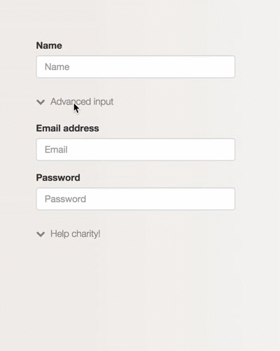
Hi there, this is part 2 of the collapsible-block article series. You might want to take a look at part 1 before starting. Here’s how the end result of the directive in this article could look like:
Grab it from github, see a quick demo here or add it as a dependency to your app using
bower install ng-collapsible-block --save.
Intro
As I briefly mentioned in the first part, today’s web interfaces are full of distractions & interruptions. Some of the better ways to prevent the noise is to use inline-expandable blocks. They’ll help maintain the context and are a great alternative to all kinds of mambo jambo, such as dialogs.
Overview
This directive is more generic than the one built in part 1. It allows expanding and collapsing any kind of content. To achieve this we’ll use a very useful option in the directive definition object: transclude.
Some background on transclusion
If you’re not familiar with the term transclusion don’t worry, you are not alone. If you’re familiar with transclusion, you can safely skip this bit. This term was coined by the Angular team quite a while ago, but it still sends shivers down the spine of some devs. You can think of it as inclusion, because that’s basically what it does.
Let’s say we set transclusion to true for a directive:
angular.module("app", []).directive("ex", function () {
    return {
        transclude: true,
        restrict: "E",
    };
});
Turning on transclusion will enable us to use the ng-transclude directive in the template:
...
  .directive('ex', function (){
    return {
      transclude: true,
      restrict: 'E',
      template: "<section>
                  <p>
Hey there, transclusion doesn't affect me
</p>
                  <ng-transclude></ng-transclude>
                </section>"
    };
  });
So far so good. Now let’s use the ex directive in a template and see where it takes us:
<ex>
  <h2>Oh boy</h2>
  <p>
Can't wait to get transcluded!
</p>
</ex>
At runtime this will become:
<ex>
  <section>
    <p>
Hey there, transclusion doesn't affect me'
</p>
    <ng-transclude>
      <h2>Oh boy</h2>
      <p>
Can't wait to get transcluded!
</p>
    </ng-transclude>
  </section>
</ex>
Pretty useful, eh? You can also use ng-transclude as a attribute directive if you fancy it. On top of that, you can transclude elements yourself using the directive’s link option. Here’s how the directive definition object could look in that case:
...
return {
  transclude: true,
  template: "<p>
Some text
</p>",
  link: function(scope, el, attrs, ctrl, transclude){
    transclude(function(clone) {
      el.append(clone);
    });
  }
};
...
Still not sure about transclusion? Dan Wahlin explains it with some visuals in this 120s video, check it out:
Building the directive
Now that we have an idea of how transclusion works, we can define a template that takes advantage of it. First let’s start with a basic structure.
<section >
  <a href="#"  ng-bind="title"></a>

  <section ng-transclude ></section>
</section>
In part 1 we added a ng-click directive which flipped a ‘collapsed flag’ & created an element for the title icon. The same setup will be done here, but we’ll use 2 icon elements this time: one for the collapsed state & one for the expanded state.
<section  ng->
  <a href="#"  ng-click="toggle($event)">
    <i  ng-if="collapsedIcon && collapsed"></i>
    <i  ng-if="expandedIcon && !collapsed"></i>
    <span>{{title}}</span>
  </a>

  <section ng-transclude  ng-show="!collapsed"></section>
</section>
A class (clps–expanded) will be appended when the directive is expanded. Another difference here is that the event ($event) is passed to the toggle method. That’s needed in this case to prevent the default action of the anchor element.
The JavaScript bit(ish)
Now that we fooled around with the template it’s time to make it interactive with some good old fashioned JavaScript.
angular.module('app', [])
       .directive('collapsible', collapsibleBlock);

function collapsibleBlock(){
  function collapsibleLink(scope, element, attrs){
    scope.collapsed = true;
    scope.title = attrs.collapsibleTitle;
    scope.collapsedIcon = attrs.collapsedIcon;
    scope.expandedIcon = attrs.expandedIcon;

    scope.toggle = function collapsibleToggle(e){
      //Prevents anchor navigation.
      e.preventDefault();
      scope.collapsed = !scope.collapsed;
    };
  }

 ...
}
Again, the directive needs to have isolate scope in order to be reused in the same module/controller without any conflicts. Putting it all together we’ll end up with something like this:
angular.module('app', [])
       .directive('collapsible', collapsibleBlock);

function collapsibleBlock(){
  function collapsibleLink(scope, element, attrs){
    scope.collapsed = true;
    scope.title = attrs.collapsibleTitle;
    scope.collapsedIcon = attrs.collapsedIcon;
    scope.expandedIcon = attrs.expandedIcon;

    scope.toggle = function collapsibleToggle(e){
      e.preventDefault();
      scope.collapsed = !scope.collapsed;
    };
  }

  return {
    scope: {},
    restrict: 'E',
    replace: true,
    transclude: true,
    template: '<section  ng->
                <a href="#"  ng-click="toggle($event)">
                  <i  ng-if="collapsedIcon && collapsed"></i>
                  <i  ng-if="expandedIcon && !collapsed"></i>
                  <span>{{title}}</span>
                </a>

                <section ng-transclude  ng-show="!collapsed"></section>
              </section>',
    link: collapsibleLink
  }
}
(sorry for the code coloring, apparently it can’t handle all this HTML in JS)
That’s it! Now we can use inline-expandable blocks with ease. ngAnimate can also be added to this directive. If it’s included as a dependency to our app, with a bit of CSS we can make it fancy and all:
.clps__content {
    display: inline-block;
    width: 100%;
    position: relative;
}

.clps__content.ng-hide-remove,
.clps__content.ng-hide-add,
.clps__content.ng-hide-add-active,
.clps__content.ng-hide-remove-active {
    transition: all 0.2s ease;
}

.clps__content.ng-hide-add {
    opacity: 1;
    animation: 0.2s fadeOut;
}

.clps__content.ng-hide-remove {
    opacity: 1;
    animation: 0.2s fadeInUp;
}

@keyframes fadeInUp {
    0% {
        opacity: 0;
        bottom: -10px;
    }
    100% {
        opacity: 1;
        bottom: 0;
    }
}

@keyframes fadeOut {
    0% {
        opacity: 1;
        bottom: 0;
    }
    100% {
        opacity: 0;
        bottom: -10px;
    }
}
See the rest of the stylesheet for the demo here.
Check out the source or a quick example on github too.
If you liked the post, you might like Shipixen—a Next.js boilerplate that allows you to ship a beautifully designed Blog, Landing Page, SaaS, Waitlist or anything in between. Today!